Brand guidelines
How to use the Kislap name, logo and colours. Listed businesses, press and community groups are welcome to use them to point people to Kislap.
Logo
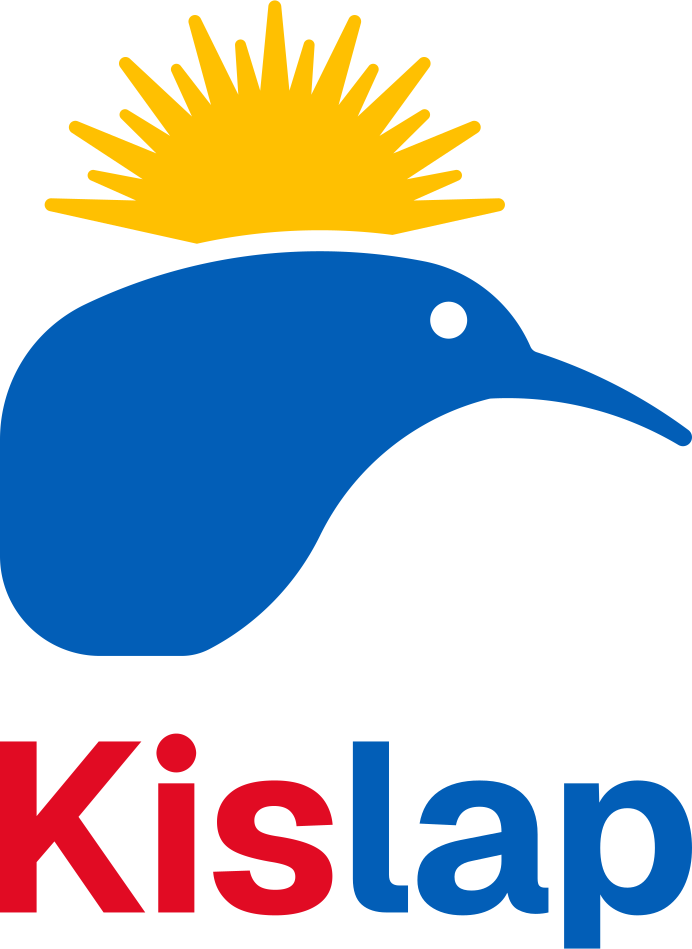
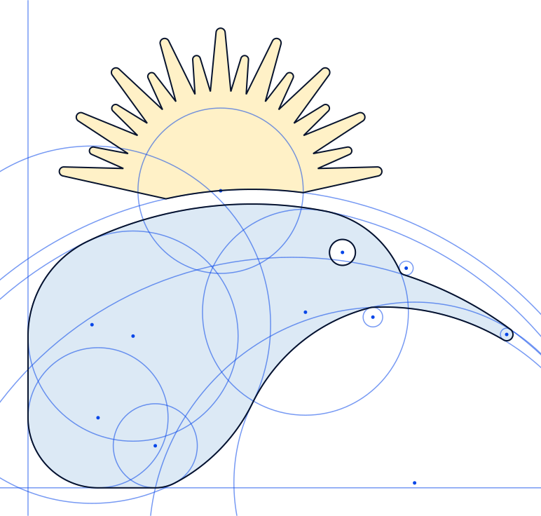
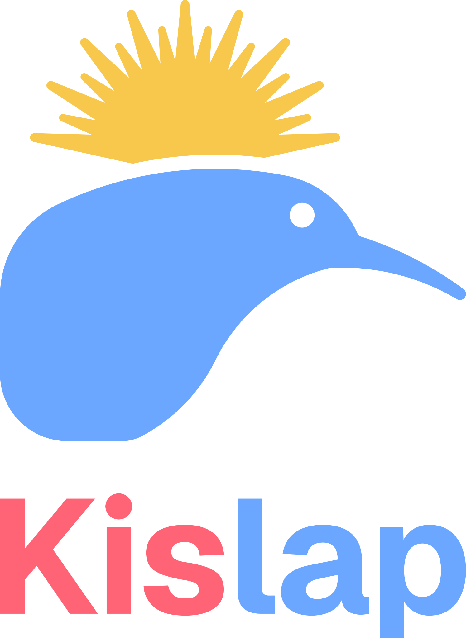
A kiwi under a rising sun. Kislap began in New Zealand, and kislap means “sparkle” in Filipino. The kiwi is drawn only from circles and straight lines: its back, head, beak and belly are arcs, and every corner is a smaller circle that meets both edges exactly. The sun’s lower edge follows the kiwi’s back at an even distance.
The wordmark is set in Geist Bold. The dot on the “i” is a true circle, like the kiwi’s eye. “Kis” is red and “lap” is blue.
Layouts
Use the logo as supplied. Choose the layout that suits the space; don’t combine the symbol and wordmark in a new arrangement.

Clear space and size
Keep a margin around the logo at least as tall as the “K” in Kislap. Nothing else should enter it: text, edges, other logos.
- Logo
- At least 48 px or 15 mm tall
- Horizontal logo
- At least 24 px or 8 mm tall
- Symbol
- At least 20 px or 6 mm tall
- Wordmark
- At least 14 px or 4 mm tall
Colourways
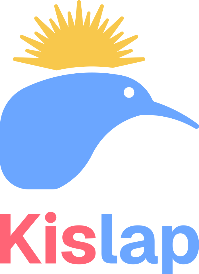
Use the full-colour logo where you can. On dark grounds, use the dark version, whose colours are lifted to stay bright. Use ink or white when printing in one colour, or over a photo.






Misuse
The logo only works when it looks the same everywhere. Please don’t alter it.
Don’t stretch or squash the logo.
Don’t change its colours.
Don’t rotate it.
Don’t add shadows, outlines or other effects.
Don’t place it over a busy image.
 Kislap
Don’t retype the wordmark in another font.
Colour
The logo uses three colours that echo the Philippine flag: sun yellow, red and blue. The site itself is set in ink on white, with action blue for links and buttons.
Logo
- Sun yellowThe sun and its rays
- Kiwi blueThe kiwi and “lap”
- Kislap red“Kis”
Logo on dark grounds
- Sun yellow, darkOn dark grounds
- Kiwi blue, darkOn dark grounds
- Kislap red, darkOn dark grounds
Interface
- InkText and dark grounds
- Action blueLinks and buttons
- MutedSecondary text
- LineRules and borders
- PaperPage ground
Typography
Kislap is set in Geist, a typeface by Vercel, free to use under the SIL Open Font License. Headings use Bold or Extra Bold with slightly tight spacing; body text uses Regular.
Find Filipino businesses near you.
Restaurants, bakeries, groceries, salons and mechanics, each checked against public sources before it goes live.
- Regular 400
- Semibold 600
- Bold 700
- Extra Bold 800
Our name
Write Kislap with a capital K and the rest in lower case. Use Kislap.com when you mean the website.
- Kislap
- Kislap.com
- KISLAP
- KisLap
- kislap
Usage terms
The Kislap name and logo belong to Kislap. You may use them to:
- show that your business is listed on Kislap and link to your listing;
- write about Kislap in news, reviews and community posts;
- print the marketing materials made from your listing page.
Please don’t:
- suggest that Kislap endorses, sponsors or has verified your business beyond its listing;
- use the logo or anything like it in your own name, logo, app or domain;
- show it larger or more prominently than your own brand.
Listed businesses can make Kislap business cards, flyers and social posts with a QR code to their listing: open your listing and choose Create marketing materials under “Are you the owner?”.
For anything else, including press and partnerships, contact us.